










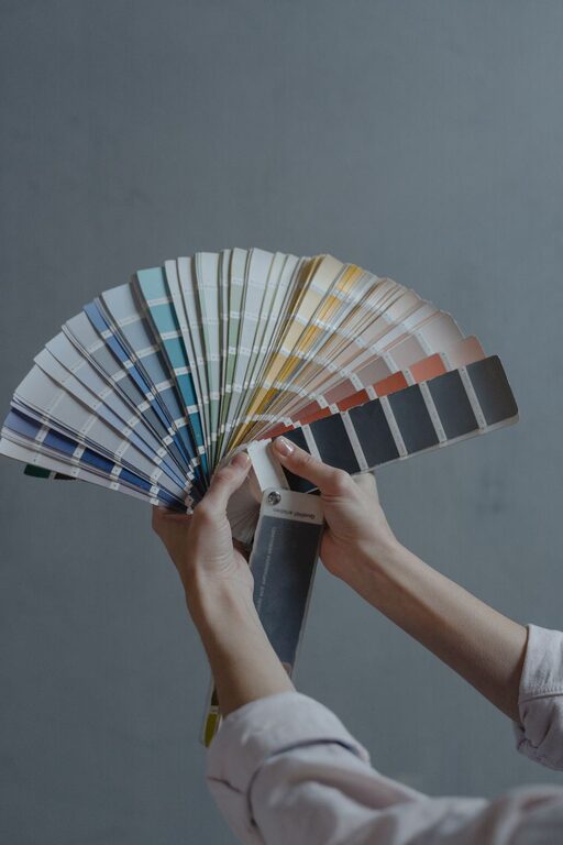
Creating a calm and peaceful atmosphere in your home starts with the colors you choose for your walls, furniture, and accessories. Colors have a powerful effect on our mood and can make a room feel relaxing or energizing. If you want your home to be a soothing retreat from the outside world, choosing calm colors is a great place to start.
In this guide, we’ll explore how to select calm colors for your home that promote relaxation and harmony. With practical tips and ideas, you’ll be able to create spaces where you can unwind and feel at ease.
Why Choose Calm Colors?
Calm colors are typically soft, muted, and easy on the eyes. They help reduce stress and create a sense of balance. Unlike bright or intense colors, calm hues don’t overstimulate the senses, making them ideal for bedrooms, living rooms, or any space where you want to feel relaxed.
Examples of calm colors include soft blues, gentle greens, warm neutrals, and light grays. These colors can work individually or together to establish a peaceful palette that suits your style.
Understanding Color Basics
Before diving into specific color choices, it helps to understand a few basic concepts about color:
– Hue: The name of the color itself (blue, green, beige).
– Saturation: How intense or pure the color is. High saturation means vivid colors, low saturation means muted or pastel tones.
– Value: How light or dark a color appears.
For calm interiors, look for hues with low saturation and medium to light value. These are less likely to feel overwhelming.
Tips for Choosing Calm Colors
1. Start with Neutrals
Neutral colors like beige, ivory, taupe, soft gray, and off-white provide a versatile and calming backdrop. They are easy to pair with other shades and add warmth without dominating the room.
– Use neutral walls to create an inviting base.
– Layer in textures and natural materials to add interest without loud colors.
2. Embrace Soft Blues and Greens
Many people associate blue and green with nature, such as the sky, water, or foliage. These colors have a calming effect on the mind and body.
– Choose muted blues like powder blue, sky blue, or slate blue.
– Soft greens such as sage, mint, or olive can bring freshness and a sense of renewal.
– These colors work well in bedrooms, bathrooms, and living rooms.
3. Consider Warm Pastels
Warm pastel colors—like blush pink, peach, or lavender—offer softness with subtle warmth. They can make spaces feel cozy and inviting without being too vibrant.
– These colors are great for accent walls, throw pillows, or décor items.
– Pair pastels with light neutrals to keep the look peaceful.
4. Use Grays to Add Sophistication
Gray is a popular calm color due to its neutrality and versatility. When used thoughtfully, it creates a sleek, modern feel without coldness.
– Opt for warmer grays with beige or cream undertones for a welcoming vibe.
– Use darker gray tones as accent colors for balance.
5. Test Colors in Different Lighting
Natural and artificial lighting can dramatically change how a color looks in your space. What seems calm in a paint sample might feel dull or too bright in your room.
– Paint sample patches on your walls.
– Observe them at different times of day and under various lighting.
6. Keep a Cohesive Color Palette
For a harmonious and calming home, limit your color palette to three or four complementary shades.
– Choose one main color and two to three accent colors.
– Use variations of your chosen colors across different textures and materials.
7. Balance Color with Texture and Patterns
Calm colors don’t have to mean boring. Introduce visual interest through texture and subtle patterns.
– Soft fabrics like linen or velvet add comfort.
– Rugs, curtains, and cushions with gentle patterns can enhance calm colors without overwhelming.
8. Personalize with Natural Elements
Adding natural wood, plants, and stone accents complements calm colors and connects your interior with nature’s tranquility.
– Wooden furniture in light or medium tones.
– Green plants boost mood and freshen the air.
– Stone or ceramic accessories add an organic touch.
Examples of Calm Color Combinations
– Soft Blue + Warm Gray + White: Cool and serene, perfect for bedrooms.
– Sage Green + Beige + Pale Pink: Earthy and warm, ideal for living rooms.
– Light Taupe + Cream + Dusty Lavender: Elegant and cozy, suits dining rooms.
– Muted Mint + Soft Gray + Natural Wood: Fresh and balanced, great for kitchens.
Final Thoughts
Choosing calm colors for your home is about finding hues that make you feel relaxed and comfortable. Start with neutrals, add gentle blues or greens, and test your choices in your actual space before committing. Remember that combining color with texture, natural elements, and a cohesive palette will bring your peaceful vision to life.
With these tips, you’re well on your way to creating a home that’s a true sanctuary—a place where calm colors soothe your senses every day. Happy decorating!